


|
Organic Juices in San Francisco:
New logo for Adina's music web site
The logo that we designed for the Adina music website had the particularity that it had to keep the characteristics of the existing logo which was already designed from another studio. We adapted the type by curving the name "Adina", enlarged the dots in order to visualize a rhythm and the point on the letter "i" to appear like a sun. The product is for fruit juices and it was important for us to find a metaphore for this. We created a logo in the form of an island, over the sea. The general feeling of the logo should symbolize sun, fruits, nature, rhythms and happiness.
|
|
Swiss Benevolment Society, San Francisco:
Non-profit organization
The SBS is a non-profit organisation helping Swiss families in financial needs for better education in the Bay Area. The previous logo was carrying a mistaken image of this noble cause. Studio AND redesigned their logo without transforming any of the three main elements: the color red, the heart and the Swiss cross. The goal was to change the hierarchy of the main message. To help Swiss people, but also showing the heart in the first place that this help is a sensible and generous gesture. Secondary, the Swiss cross is visible in a more abstract way.
|
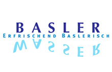
IWB:
Basler Wasser
The IWB, the energy company of the town Basel in Switzerland has been a long lasting partner with studio AND since they redesigned their complete corporate image in 1995.
IWB owns a small water source over a hill of Basel and it is their pride to prepare this little but good water in the town. Bottled in very small amounts, you can drink this fine water only in public events and at the Basel restaurants. The label had to be redesigned and 3 agencies have been invited to propose a new design. Here is the research of AND. Developped within 2 intensive weeks in a team of 4, over two continents, this exploration shows the great interest of AND toward a product such as water and demonstrate its ability to find quickly appropriate solutions. |