
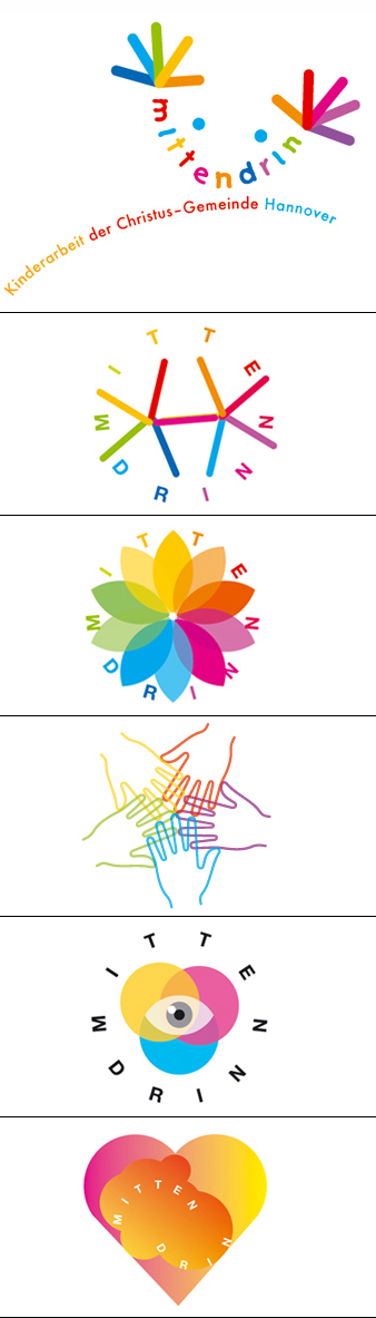
Mittendrin:
A logotype for children about children
Created in close collaboration with the client, this
logotype is a good example that demonstrates the
complex ways that visual development may have to
take until it finally reaches a point where both the
client and the designer can indentify themselves
completely with the visual creation.
Based on a phone-breefing and some e-mails, the management of this non-profit organization – like it is often the case – had many expectation to be feed into a single logo; it is with real professionalism that one can integrate all those elements together. The clients wanted that feelings such as "happy mood", "spontaneity", "movement from center toward outside" could be expressed. Shapes as ink splashes, heart, eyes, hands, smooth surfaces, braught into a colorful mix and in addition integrating the name of the non-profit organization into an expressive typography related to childhood had to be searched and discovered almost like a puzzle into this logo composition. Connected with a christian-community organization "Mittendrin" management did not wanted to refere to the religion and the symbolic of eyes could not be used, because too much symbolism related to the eye of the Divine. The final choice went toward movements and colors. The chosen symbol presented on the top of this page expresses all what was expected and adds with the use of diverses colors the idea of a happy children face which smiling mouth and eyes are part of the typography. Two colorful hands are a metaphor of the activities of a peaceful multi-cultural community of children playing together mixed with diverses religions backgrounds like those which can be found all over Europe. |
