
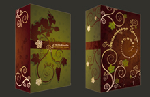
Another way to approach our wine consumption:
Research: Trendy box versus traditional bottle
Knowing that glass is a recyclable material but heavy and costly to transport,
Studio AND is interested by the emerging solutions of sustainable ways to drink
wine. New technologies in packaging can now allow to provide boxes
containing the amount of four bottles while keeping the quality of a wine. If
well design this solution can carry the message of a good and modern wine.
|
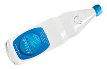
A label for a water bottle:
Case studies: The drinking water "Basler Wasser"
The design of a label for a product such as water demands an approach
where both, respect of tradition and originality for a modern appearance are
needed. The market is competitive and growing and the look of water
bottles has drastically evolved in the last decade, as more and more water
becomes a product in trend.
|
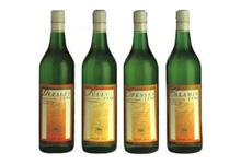
Dressing a family of wines:
Series: A wine family in the Swiss region of "Lavaux"
From "smooth" to "dry", from "good body" to "bright acidity" or from "rich" to
"fine", the various flavors of a wine are often complicate to express. We have
created a line of wine labels which colors are evolving according the region and
the diverse characteristic of it's grapes.
|
|
When soft drinks become holistic beverages:
Visual adaptation: Adapting an existing logo
At the early stage of Adina – a new-age drinks company based in San Francisco –
our Studio had the chance to explore variations of their logo in order to relate
their product with music. Adina now reinvents the way of "soft drinking" offering
a line of holistic drinks which rather than sugar-laden fillers with manufactured
vitamins and chemicals utilize actual herbal content.
|
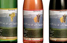
Photography of grapes on wine labels:
Creation: Gamay and Chasselat from "Jura"
Arnex-sur-Orbe is a little village situated at the bottom of the Jura hills which
vineyard are facing the south toward the Lake of Geneva. That is certainly why
both the water from Jura and the sun from the Lake bring to this little wine
a particular flavor. We combined the typical view of the Jura hills with the two
main kind of grapes that one can find there.
|
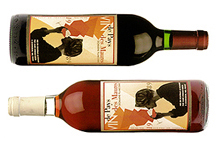
If a wine label looks like a poster:
Label design: Rosé and Red for South of France
The two wines of a young Swiss wine maker who emigrated in South of France
needed to receive a new look to become the wine of a younger generation.
Our graphic approach was to step away from the traditional design of french
wine labels, imagining young people passing by in a general store to pick up
a wine on their way to a dinner or a party.
|
