Frisco Remix:
The letter "O"
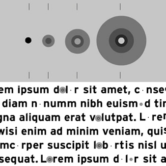
Imagine a single letter which is always missing. This was our idea for the most simple letter of the alphabet. The letter "O" is a circle. Our intention was to create a non-existent character, signified by its center, as a core in a phase of projection, expanding itself towards its external environment. A letter in motion which is recognizable without being completely physically present.
For this font family, 27 designers were asked to create one letter, a lowercase and a capital, as a specimen for their own design style, esthetics, humor, visual language, craftsmanship or philosophy. Claudia and Jean-Benoit combined here again their common knowledge, bringing their interest for type and passion for motion together. In an animation, they demonstrate their concept in real, while in the font for print, the missing letter is represented either by a small dot or a black hole. |


